


How to Choose Paint Colours That Work with Your Tiles
This guide offers general design advice on pairing paint and tiles. Results will vary depending on lighting, tile finish and existing decor, so test colours at home before you commit to a full room.
Estimated reading time: 4 minutes
Paint and tiles work together when the wall colour matches the tone already sitting inside the tile. Look at the undertone first: is it warm, cool? Maybe it's neutral? Get that right and everything else falls into place. A patterned or richly coloured tile usually needs a calmer paint around it, while a plain neutral tile gives you far more room to play. Have a browse of our paint collection to see how our shades group by tone, which makes matching a lot more straightforward.
- Find your tile's undertone before you pick up a paint chart.
- Matching warmth, not just colour, is what makes a pairing feel considered.
- Neutral tiles give you the most freedom to experiment.
- Patterned or bold tiles need calmer walls around them.
- Test the paint against the actual tile before you commit.
- Light changes how both tile and paint read through the day.
What Undertone Does Your Tile Have?
Hold a tile up on a grey afternoon and it can look like a completely different colour by evening. That shift is the undertone at work. Most tiles carry one, leaning warm with a touch of yellow, pink or beige, or cool with a touch of grey or blue. Some are genuinely neutral, and it's often hard to tell which under artificial light. So take your swatches to the tile, not the other way round. Prop a few paint cards against an offcut near a window and watch what happens. Do any of them feel slightly wrong next to the tile, a bit off somehow? That's usually the undertone clashing, and it's worth trusting that instinct.
Which Paint Colours Go with Warm Toned Tiles?
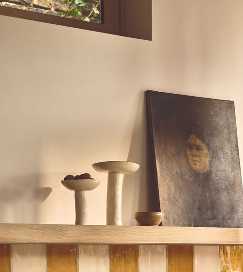
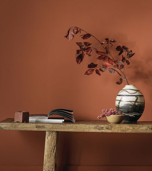
Warm tiles are the ones with a yellow, terracotta or pink undertone, and they sit best with paints from the same family. Picture soft clay or muted gold: colours that feel like they've been drawn from the same palette as the tile itself. A gentle green works too, adding a little life without breaking the warmth. These shades sit alongside honeyed stone or beige tiles without a fight. A cold, blue based grey on the walls can make a warm tile look tired or out of place, so it's best avoided here. A strong terracotta or rust tile calls for something deeper and earthier on the walls or woodwork, which grounds the whole room.
Which Paint Colours Go with Cool Toned Tiles?
Cool tiles carry a grey, blue or slate undertone, and they thrive next to paints from that same cooler family. Soft blue keeps the tone consistent rather than fighting it, and chalky grey does much the same job with a little more warmth underneath. A crisp white can work well too, particularly in a room that gets plenty of natural light. A warm cream or yellow based white can look slightly muddy against a cool grey tile, especially where light is limited. Try a paint a shade or two softer than the tile itself. That way the tile stays the focal point, and the walls simply do their job, quietly, in the background.
How Do You Match Paint to Patterned or Coloured Tiles?
A patterned tile can feel like a small piece of art, and it deserves to be treated that way. The best pairing comes from lifting the quietest tone within the design. Don't try to match every colour in the tile: find the calmest shade and use that on the walls. It reads as intentional rather than busy. Adding another bold colour nearby tends to overcrowd a small space. And if the tiling is the true star of the room, say a splashback or a feature floor, keep the walls a soft neutral. Give the tile room to breathe.
Does Lighting Affect How Paint and Tiles Look Together?
A room never looks quite the same first thing in the morning as it does at dusk, and that's exactly why light matters so much here. Rooms facing north tend to get a cooler, flatter light, so both paint and tile can look greyer than you'd expect. Rooms facing south get warmer, golden light, which draws out warm undertones in both. Check your chosen pairing at different points in the day, including in the evening under lamp light. A shade that looks balanced at noon can shift quite a bit by evening, so a little patience here pays off.
Should You Match Paint to Tile Exactly, or Create Contrast?
Matching paint and tile too closely tends to flatten a room, so a touch of contrast usually works better. Try a paint a few tones lighter or darker within the same colour family: enough to build depth, without breaking the connection. Strong contrast, a pale tile against a deep, moody paint, works beautifully in a smaller space like a cloakroom. In everyday living rooms though, a softer, tonal approach tends to feel calmer and easier to live with.
Find the calmest shade and use that on the walls. It reads as intentional rather than busy.
”