

Warm vs Cool Paint Colours: Matching Tones to Tiles
Estimated reading time: 5 minutes
Colour has a temperature, just like a room does. Some shades bring warmth in with them. Others cool a space right down. When you're choosing paint colours to match tiles, that's really the first decision to make: warm vs cool colours, and which side your tiles sit on. Get your tiles and your walls speaking the same colour language, and a room feels settled. Get it wrong, and something will niggle at you, even if you can't say exactly what.
What Colours Naturally Pair Well Together?
Before you get into specific paint names, it helps to know the basic principle. Colours generally split into two families, warm and cool, and pairing within the same family is what keeps a room feeling coherent.
| Colour family | Typical hues | Pairs naturally with | Mood it creates |
|---|---|---|---|
| Warm | Reds, oranges, yellows, browns, terracotta | Other warm tones, or warm neutrals like cream and off-white | Cosy, inviting, grounded |
| Cool | Blues, greens, greys, some purples | Other cool tones, or cool neutrals like pale grey and stone | Calm, airy, restful |
| Warm neutrals | Cream, ivory, beige, taupe | Both warm accents and, carefully, muted cool tones | Soft, versatile, easy to live with |
| Cool neutrals | Pale grey, stone, soft white with a blue or green base | Cool accents, and pale warm tones in small doses | Fresh, understated, contemporary |
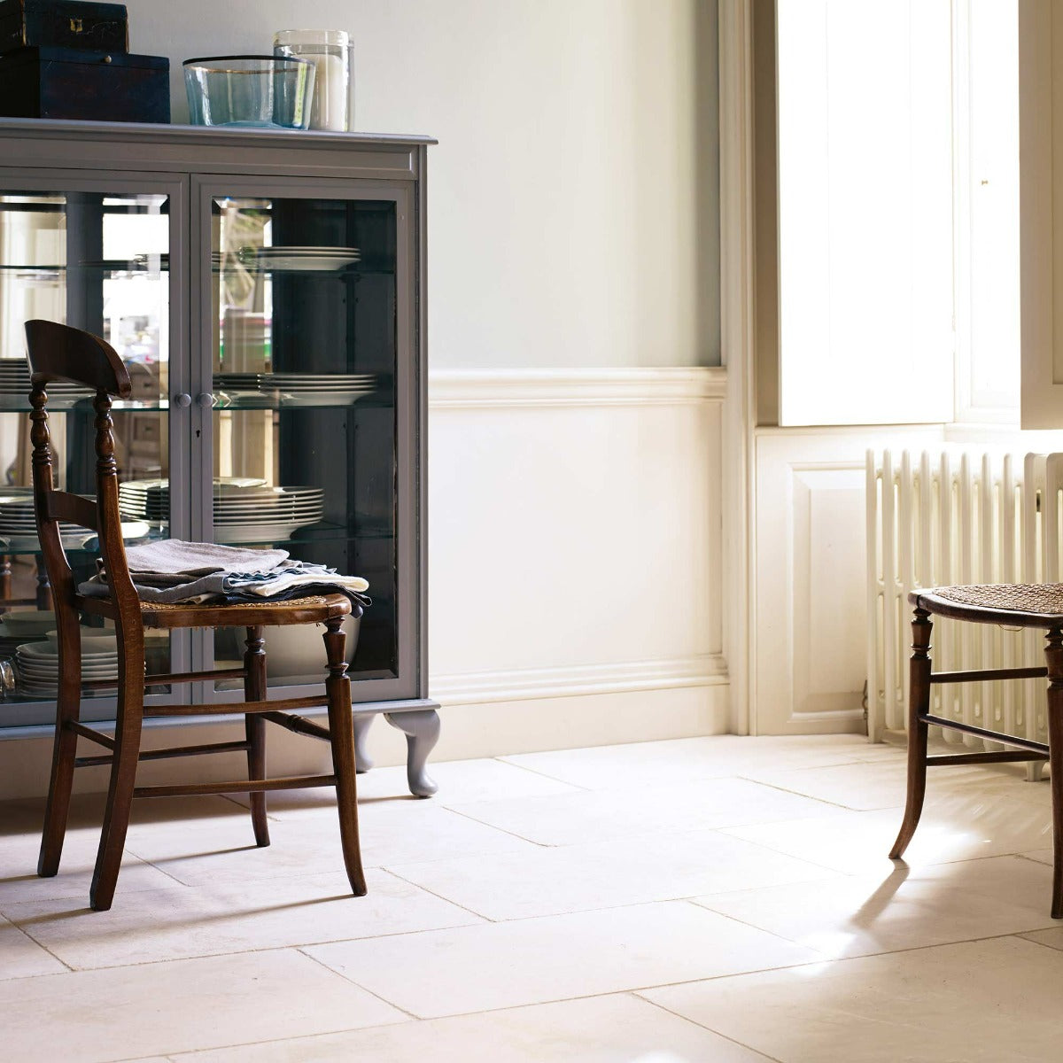
That's the underlying logic. Warm tile colours, think terracotta, ochre stone or a wood effect finish, tend to sit best with warm paint colours. Cool tile colours, like pale stone, marble or grey porcelain, usually call for cool paint colours instead. It's rarely just one pairing that works though, so once you know which family your tiles belong to, it's worth seeing how specific paint colours within that family behave.
How Do You Match Warm and Cool Wall Colours to Your Tiles?
Here's the thing about undertones: they do a lot of quiet work. Matching paint colours to tiles well means a room feels effortless. Get it wrong and you can't quite say why, but something niggles.
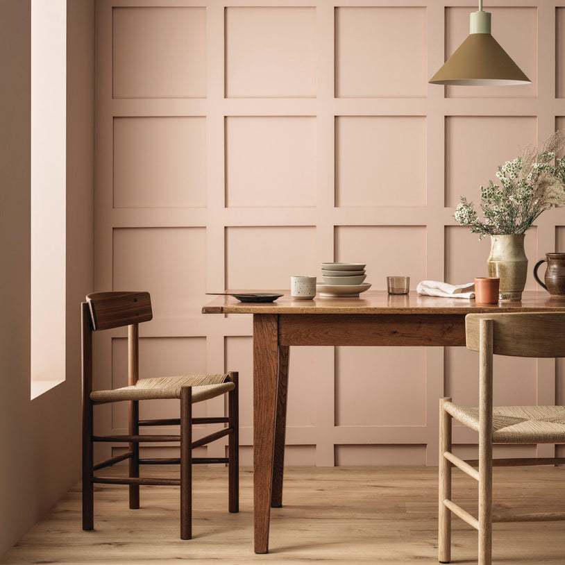
Named after the Tuscan city of Siena, Fired Earth describes it as a bright, historic colour, one of the paint colours worth considering for warm-toned tiles like terracotta and warm stone. You'll find similar shades in the Earthy Tone Paint collection.
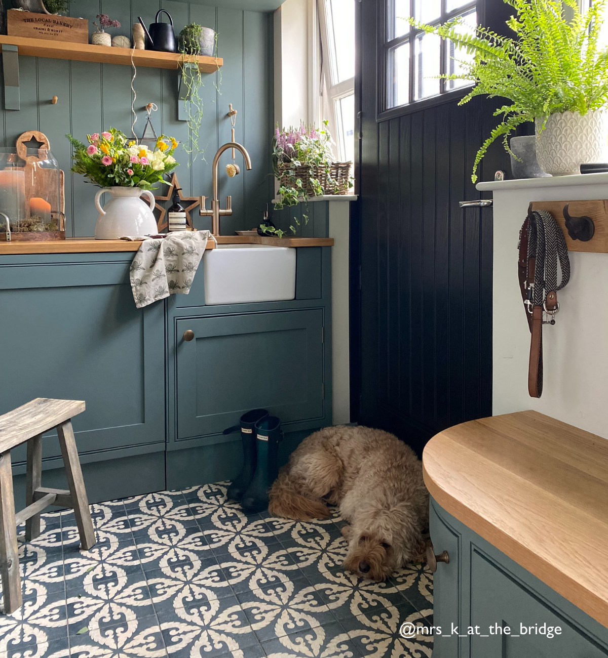
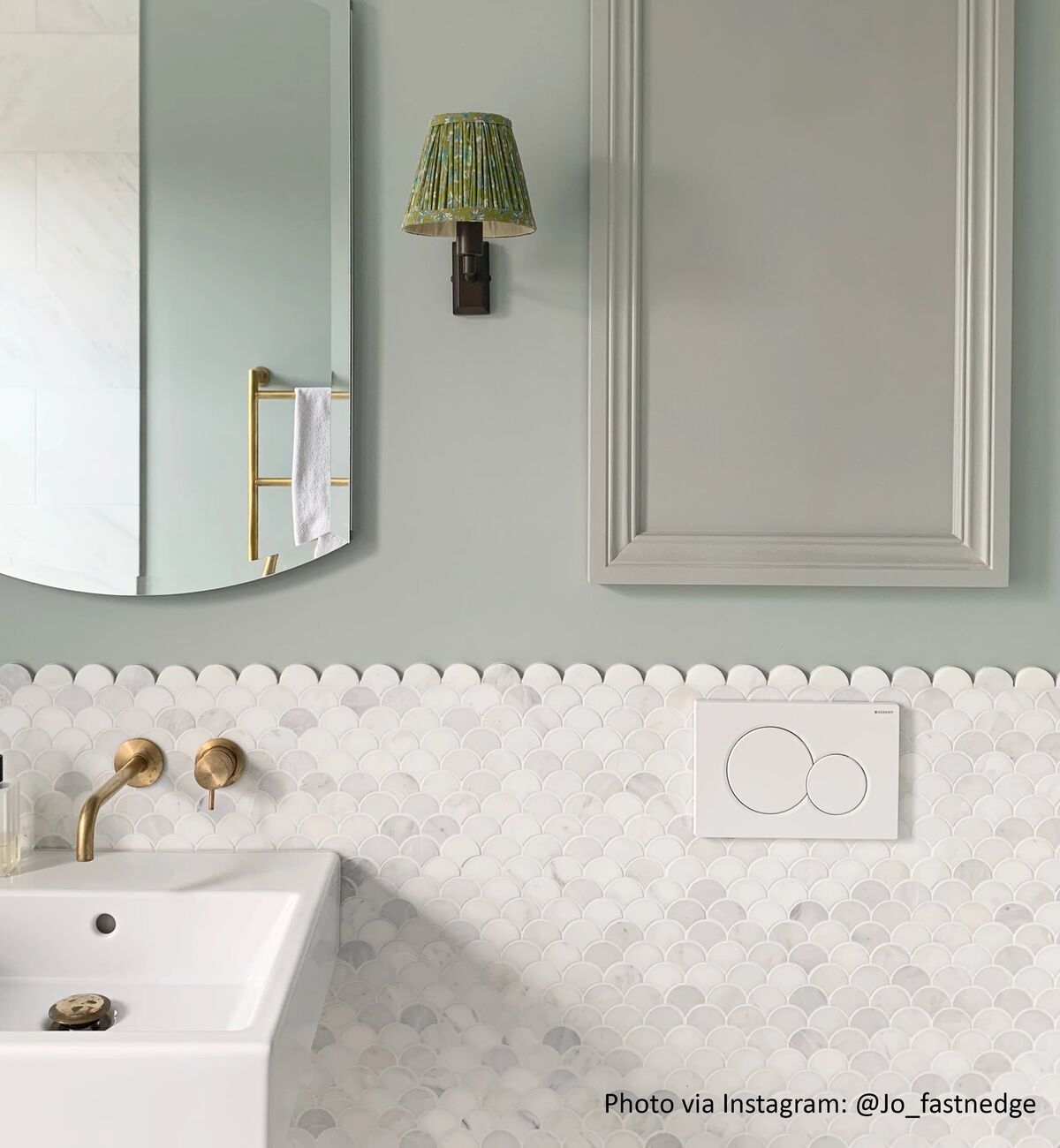
Described by Fired Earth as a light, graceful sea tone with hints of grey, one to consider for cool-toned tiles like pale stone or marble. It sits within the wider Blue Paint range if you'd like to see more like it.
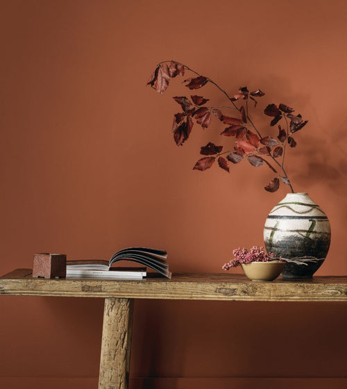
Brings a warming, golden tan into a room. Fired Earth describes it as earthy and reassuring, another option worth a look for tiles with an orange or terracotta lean.
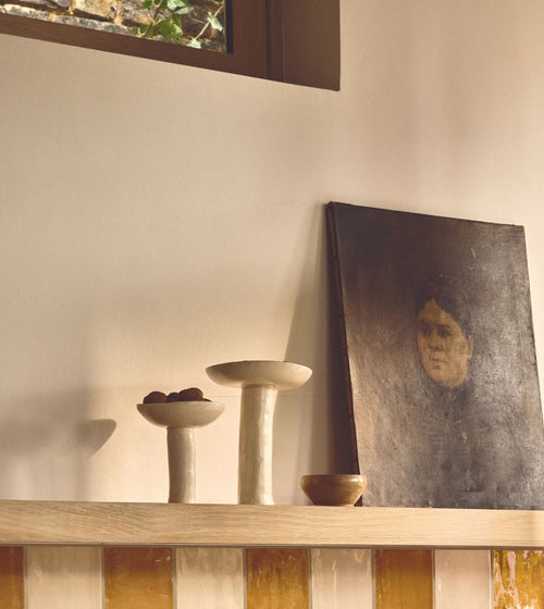
A neutral, stone coloured shade with hints of green. Worth considering for grey or stone toned tiles, though this is our own read on it rather than a claim Fired Earth makes directly.
So, which one is speaking to you? Order a sample of whichever catches your eye and hold it up against your tiles at home. Colour looks different in every light, and there's no substitute for seeing it in your own space before you commit. For more general guidance, Fired Earth's own advice on choosing a paint colour covers how light and room aspect affect your decision too. Or browse the whole paint collection to see the full range of warm and cool paint colours on offer.
Which Paint Colours Complement Each Other for Warm and Cool Tiles?
| Paint colour | Colour temperature | Pairs well with (per Fired Earth) | Tiles we'd suggest considering it for |
|---|---|---|---|
| Sienna Earth | Warm, earthy | Chalk White, Old White | Terracotta, ochre stone, warm wood effect tiles |
| Polo Coat | Warm, golden tan | Olive greens, plastery neutrals | Warm terracotta or ochre toned tiles |
| Cobble | Neutral, stone toned with a green hint | Old White, China Clay, Malachite | Grey or stone toned tiles |
| Ultramarine Ashes | Cool, sea blue green | Pale grey greens, deep teal | Pale stone, marble, cool porcelain tiles |
The paint pairings above (the 'pairs well with' column) come directly from Fired Earth's own product descriptions. The tile suggestions are our own guidance based on colour temperature, not an official Fired Earth pairing claim. All four colours are available in Eggshell and Matt Emulsion finishes, and are made in the UK. Not every finish and size combination may be in stock at once, so check the product page for current availability and pricing.
Warm alongside warm, or cool alongside cool.
”Why Does Matching Paint to Tile Tone Actually Matter?
A room is never just one colour. It's the wall talking to the floor, the floor talking to the light coming through the window, and so on. Put a warm paint next to cool tiles and each might look fine by itself, but together, something feels unresolved. You can't always name it, but you'll feel it.
Working out how to choose a paint colour for tiles really comes down to matching the temperature: warm alongside warm, or cool alongside cool. Do that, and the room stops feeling like a collection of choices. It starts feeling like a place you actually want to be in.