

What Are the Best Bathroom Colour Ideas for a Beautiful, Timeless Home?
The best bathroom colour ideas are the ones that suit your space, your light and the way you actually live in it. It's not just about what looks good on a mood board. Explore our paint collection to find colours formulated for every room in the home, including the bathroom.
Estimated reading time: 6 minutes
Key Takeaways
- Light is one of the biggest influences on how colour reads in any bathroom.
- Soft neutrals and warm whites are enduringly popular. There are good reasons for it.
- Deep colours are not just for big bathrooms.
- Finish is as important as colour in a bathroom.
- Tiles and paint work best when one leads and the other supports.
- Artificial light is more influential than most people realise.
- The most characterful bathrooms are built on small details, not grand gestures.
What makes a bathroom colour palette work, and where do I start?
Light is one of the biggest influences on how colour reads in your bathroom. Forget the paint chart. Start with light.
Natural light shapes everything. A bathroom that faces north will feel very different to one that catches afternoon sun. Spend a day noticing your light. Is it warm and golden, or cooler and flatter? Warm light suits earthy tones. Cool light suits crisper palettes. It's a simple place to start, and it shapes every decision that comes after.
And proportion matters too. A smaller bathroom doesn't automatically call for white walls. A rich colour, handled well, can feel more considered than a pale room that simply hasn't been thought through.
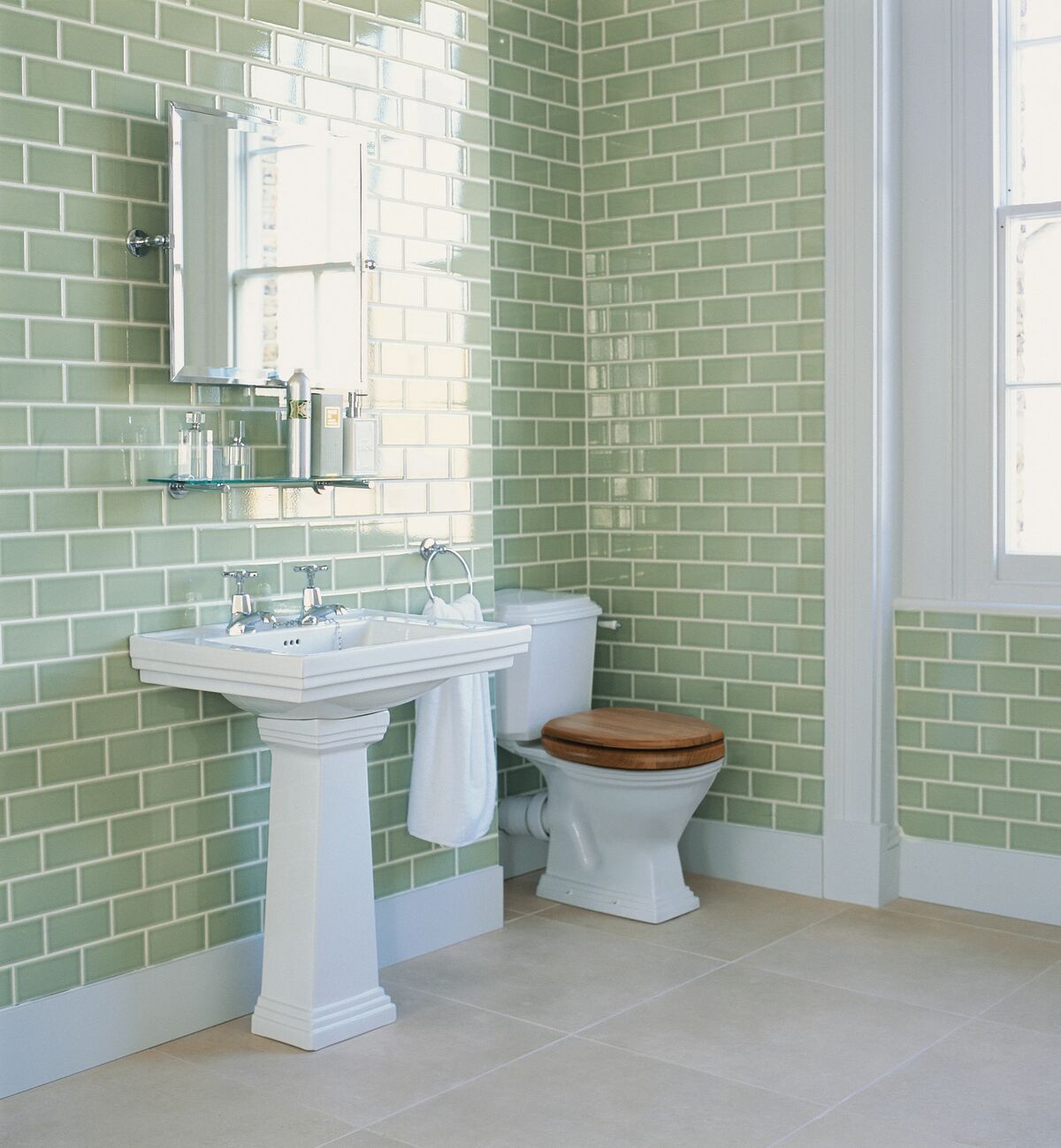
Are soft neutrals and warm whites still the most popular bathroom colour ideas?
Soft neutrals and warm whites are enduringly popular. There are good reasons for it.
The bathroom is a room you begin and end your day in. It works best when it feels unhurried. Pale tones in stone, chalk, bone or linen give you exactly that.
But not all neutrals are the same. A warm or cool white can read very differently depending on its undertone. A white with a green undertone reads clinical under cool light. A white with a warm base reads softer and more settled. The difference is real.
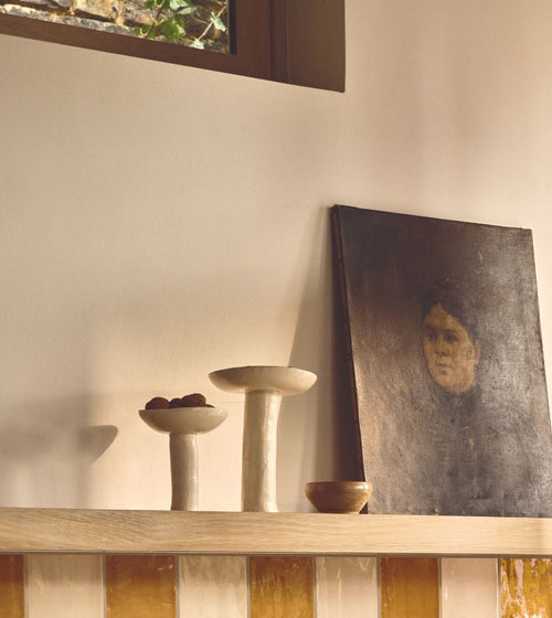
Consider mid-tones too: a dusty pink or a muted sage. They bring colour into the space without drama. They age well. And they're a confident choice for any bathroom that needs to work hard.
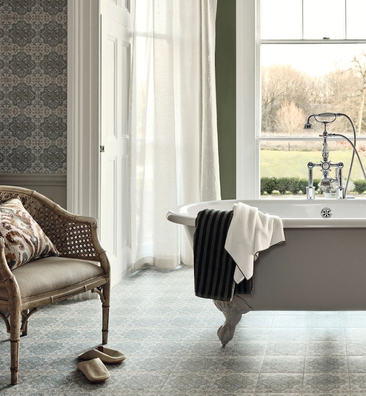
Can deep or bold bathroom colour ideas work in a smaller space?
Deep colours are not just for big bathrooms.
Sometimes a smaller bathroom is exactly the right place to try them. The investment is contained. The impact, done well, can be remarkable.
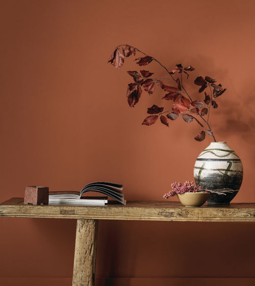
Inky blues, forest greens, warm charcoals and aged terracottas all sit well in bathrooms. Used on all four walls, they create depth that a pale palette rarely achieves.
Keep the rest of the scheme simple: neutral sanitaryware and hardware that doesn't compete. That's where it works.
In a smaller space, the instinct is often to resist depth and reach for light, but a bolder approach can work beautifully. Colour drenching, taking a single shade across walls, floor, ceiling and even the woodwork, removes every visual boundary and allows the room to feel complete rather than cramped. A compact bathroom tiled in a continuous deep green or warm charcoal, with the ceiling drawn into the same tone, becomes a room that feels deliberately intimate: cocooning rather than confined. The ceiling is often overlooked as a design surface, but including it closes the space into something whole, softening the hard edges between wall and ceiling and lending the room a quiet, enveloping warmth.
Not ready to commit to all four walls? A single painted or tiled wall behind the bath or basin introduces depth without closing the space in. Done with intention, it becomes a focal point rather than an afterthought.
What paint finish is best for bathroom walls, and does it really make a difference?
Finish is as important as colour in a bathroom.
Steam and condensation mean you need a finish that resists moisture. An eggshell or soft sheen is usually the right call for bathroom walls. It holds colour well and gives you a surface you can wipe down.
Dead matt finishes look beautifully soft. But they're better suited to rooms where moisture isn't an issue.
There's something else worth knowing. Finish changes how deep a colour reads. The same shade in matt will look richer and more absorbed than in a sheen finish, where it reflects more light. If you're choosing a darker shade, always sample it in the finish you intend to use. Not just the colour card.
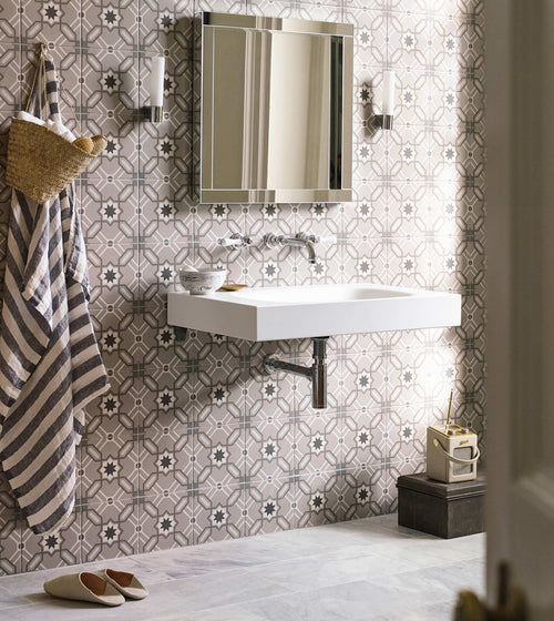
How do bathroom tiles and paint colours work best together?
Tiles and paint work best when one leads and the other supports. That's the principle.
A bathroom where both tiles and walls are competing for attention rarely feels resolved. It tends to read as busy, and the quality of each material gets lost.
If your tiles are the main event, let the walls step back. Take a tone from within the tile palette and use it at lower saturation on the walls. Both elements will feel more considered for it.
If your tiles are simpler and more neutral, the walls can do more. That's where colour has room to contribute.
And don't overlook grout. A contrasting grout brings pattern forward. A tonal seamless grout creates calm.. In a smaller bathroom particularly, a grout that closely matches the tile can make a wall or floor feel larger and less interrupted.

How does lighting affect which bathroom colour ideas will work?
Artificial light is more influential than most people realise.
Most bathrooms rely on it for a good part of the day. So the quality of your bulbs matters as much as the quality of your paint.
Warm white bulbs, around 2700 to 3000K, suit earthy tones and palettes drawn from stone. They bring out warmth in greens and soften neutrals. Cool white bulbs, around 4000K, suit crisper palettes: clean blues and graphic tile schemes.
Test your shortlisted colours under your actual lighting. A colour that reads beautifully in daylight can shift under a warm bulb. Or reveal something even better. It's worth checking before you commit.

How do I add depth and character without overwhelming the space?
The most characterful bathrooms are built on small details, not grand gestures.
Hardware is a good place to start. Taps and towel rails in warm brass or aged bronze add warmth to a pale palette without adding noise. In a darker scheme, matte black hardware creates quiet definition.
Texture does a lot too. A handmade tile with visible glaze variation or a limewashed wall brings character that no flat colour achieves on its own. These are the details that make a bathroom feel designed rather than decorated. The ones you notice over time.
Choosing colours you'll live with happily for years takes a bit of guidance. That's what we're here for. Browse our paint collection to explore colours chosen for their depth, versatility and ability to work alongside our tile and material collections.
Disclaimer: This guide is for inspiration and general planning. Colour can look very different depending on your light, the finish you choose and the specific products you use. We always recommend ordering samples before you commit, and contacting us for advice tailored to your space. Product availability, finishes and colourways are subject to change.