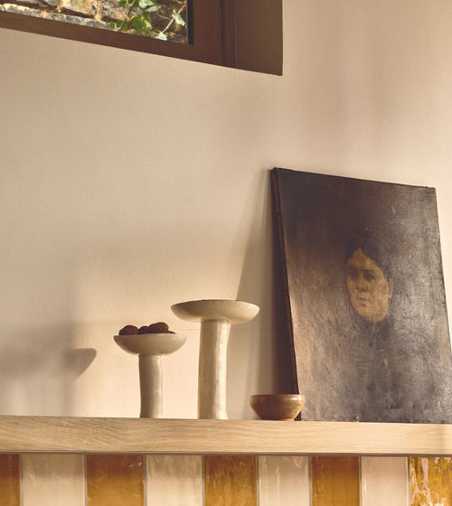
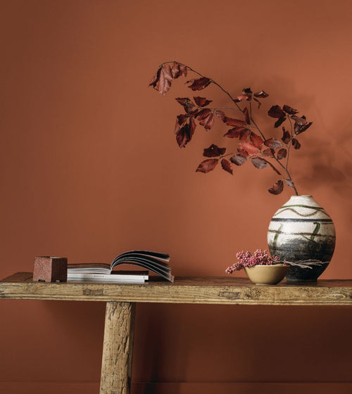

Fired Earth’s stunning Paint Collection allows you to artfully create a look that is distinctively yours, allowing you to layer up your interior tone-on-tone over time. Key colours combine with new neutrals to act as a beautiful backdrop to your treasures and heirlooms.
The colours that make up Fired Earth’s colour palette have a delightfully matt and chalky finish. The colours also feature exceptional coverage leaving your walls with a beautiful depth of colour that cheaper brands cannot reproduce. Our Paints are made in the UK by our historic paint factory using a high percentage of pigments and only the best resins and binders.
Colour Consultation Service
Our Colour Consultants are always available should you need help in making your decisions. They can visit you at home, £50 for a single room or £150 per hour for multi room projects, or hold a free virtual consultation.
Tip 1
Natural daylight varies according to both the time of day and weather conditions. The same colour can often appear completely different from area to area and depending on the height of the sun. For example, the light when full sun is streaming through a window has a very different feel from an overcast day. This changeability is of course completely fascinating but we know it can add an extra dilemma to your colour choices. In addition, the direction your room actually points has a terrific effect on colour.
Tip 2
North facing rooms can be the most challenging to decorate. Light coming in from the North is cooler and icier in tone and British light in particular tends to lend itself to cooler blue/ grey hue. Consider using colours with a hint of warm pigment, or if you are using blue ensure the colour has a little more depth and avoid any pale cold colours which are saturated with a high percentage of white pigments.
Tip 3
Light yellow/cream based whites reflect the light without looking to cold and clinical. Creams are also very sympathetic and keep your décor on the sunnier side of the spectrum. You can of course choose from a whole range of pinks, reds and taupe’s but avoid anything with a lilac base as again this will reflect cooler light.
Tip 4
The light in East facing rooms can appear to be a little greener so sometimes its advisable to work with this and choose greens or blue/greens. Thus creating as much light as possible but still retain some warmth, look at pale delicate colours which will really come alive in the morning sunlight.
Tip 5
The light will change so dramatically through the day it is often good to team these with a darker tone on woodwork or furniture so that the walls appear lighter in contrast. If you want to work with white, choose one with an off-white base. Pinks and Taupe’s will also really intensify under this lighting adding a delicious rosy glow.
Tip 6
South-facing rooms offer far more flexibility and options - they are full of warm light all day, so all colours will look vibrant and true. We recommend really maximising the feeling of light and space in south facing rooms by choosing pale tones.
Tip 7
Soft blues combined with a mellow stone grey will create a wonderfully relaxed look, while gentle green/blues like will create a beautiful muted tonal look. If you really want to create a wow of colour consider painting some details in a dramatic colour. These blues although deep and rich are perfect as a backdrop to artworks and look amazing as a pop of colour on a trunk or bookcase. A South facing room is perfect for a smart grey paint, paint skirting boards and trims in a grey-toned white.
Tip 8
Light in west-facing spaces can be cooler at first light then burst with intense light later in the day. West Facing Rooms can utilize white walls as natural light reflectors will flatter any colour of furnishing which is often why we choose neutrals for our homes, but white will really enhance both natural and artificial light in west-facing rooms. Even greyer neutrals should retain a feeling of light and neutrality – although the colour will change from morning to evening and with the addition of lamps and spotlights that warmth will amplify even more for a cosier feel.
Pure whites:
White interiors will never go out of fashion. Go ceiling to skirting boards in one colour or, for a softer effect, layer up a selection of our favourite off-whites to create a soft, delicate Danish-inspired palette.
Artificial Light:
Artificial light will also affect how colours can appear in a room as different bulbs have varying factors of wattage and light. Spotlights and luminescent bulbs emit a yellow fluorescent light that will make colours appear yellow-toned. This is perfect if your scheme uses pretty, yellow-based neutrals, but may counbter the edgy, urban look created by greys with blue undertones. LED lighting emits blue light and is more suited to modern interiors. Choosing a bulb which emits a white light will make colours appear as close as possible to daylight so you will see the truest impression of the colour.
Working with sample jars:
Once you’ve narrowed down your choice of colour we always recommend painting a sample on to a piece of A4 paper or card to see how the shade works in your space. Move it around the room and look at the colour at different times of the day so you can see how the colour is affected by the changing light. Thgis can sometimes be better than painting on to actual walls as the colour may look different on walls facing different directions. Plus, you will no doubt end up with lots of different coloured blobs to paint over. Why make work for yourself?
Small rooms without windows:
The natural inclination is to use a pale colour to open up the space. This can work wonders, but the drama of a deep colour in a small, windowless room can also be fantastic against the glint of a picture frame or other loved objects.
Lightbulbs:
Consider changing wattage and lampshades to enhance the colour. For example, a black or taupe lightshade not only looks luxe but will soften harsh lighting.
And finally:
Don’t discount the effect of curtains, blinds and shutters on your finished paint colour. Play with light, texture and tone.
Using our website:
We do always advise trying a sample jar as colour can look very different in different lights and situations. Also, computer screens vary considerably in their representation of colour. As well as our beautiful paint cards, we also sell a design swatch book which will allow you to view all our 120 colours at home in larger swatches.
Order a paint card here